
Kodak vs Fujifilm Color: Which Look Fits Your Photo?
Compare Kodak- and Fujifilm-inspired color without relying on brand shorthand. Learn what to inspect in skin, greens, highlights, and shadows.
 FilmFX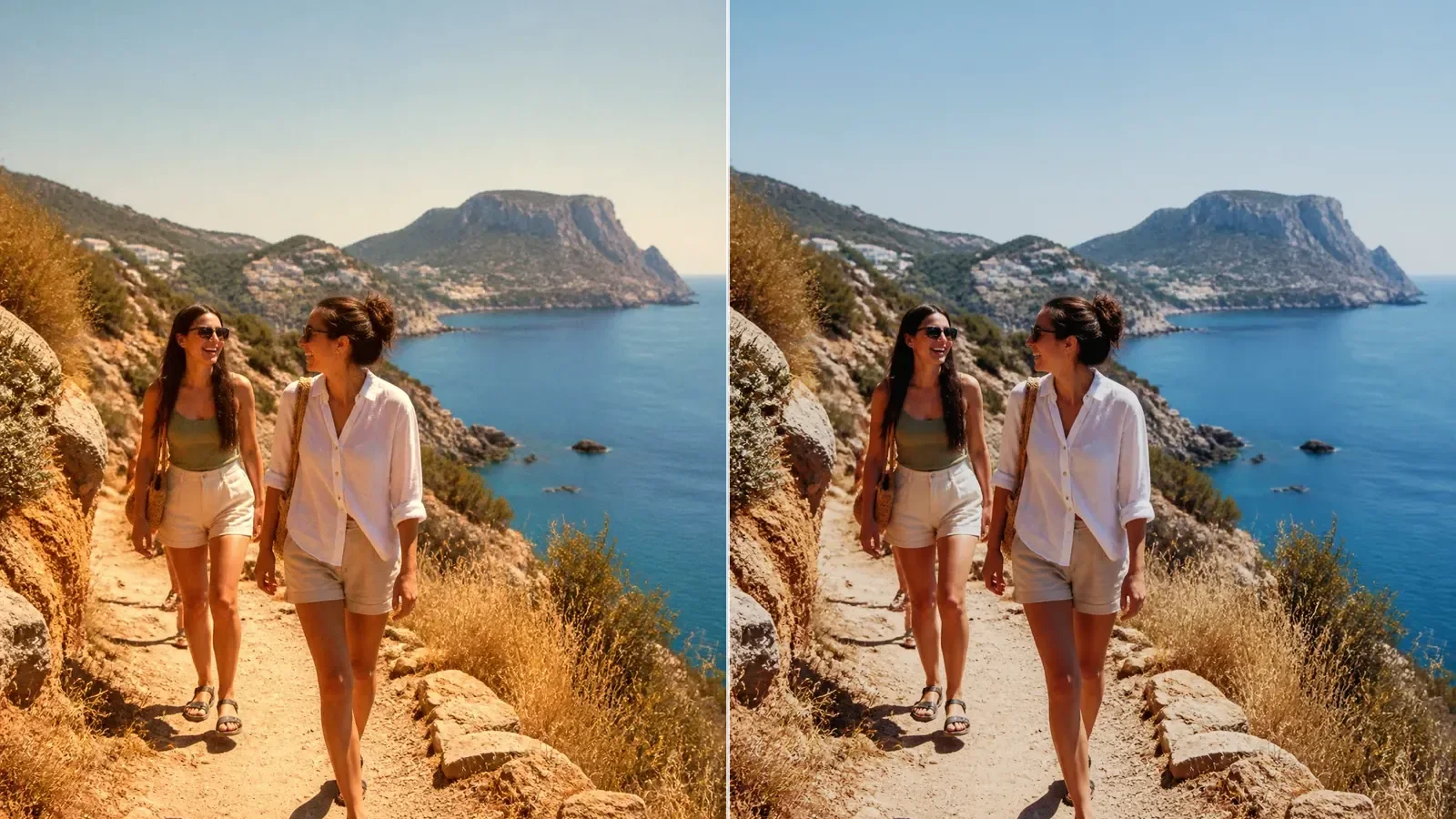
There is no single “Kodak color” and no single “Fujifilm color.” Both names cover different films, digital interpretations, exposure choices, processing, and scans. The useful comparison is not simply warm versus cool. It is how a particular look handles the colors and tonal relationships already present in your photograph.
If you want a quick starting point, Kodak-inspired options often suit warm daylight, people, travel, and familiar album color. Fujifilm-inspired options offer a wider spread in FilmFX: neutral everyday color, restrained documentary palettes, soft portrait color, vivid landscapes, and low-saturation cinema tones. Those are starting directions, not rules.
Why two examples of the same “brand look” can disagree
A film photograph is not the film stock alone. Exposure changes density and color. Development changes contrast. A scanner and its operator make another interpretation. Prints age. A digital camera profile or browser filter adds a different pipeline again.
The source photograph matters just as much. Warm indoor white balance, a cool overcast scene, clipped highlights, or saturated phone processing can push the same filter in opposite directions.
That is why a comparison should use the same source file, the same crop, and the same strength. Otherwise you are mostly comparing two photographs.
Compare these five areas instead of the logo
| Area | What to inspect | Warning sign | | ---------- | -------------------------------------------------- | ------------------------------------------------------- | | Skin | Variation between cheek, lip, forehead, and shadow | The whole face becomes one orange, pink, or gray tone | | Whites | Shirts, walls, clouds, paper, signs | Every neutral surface picks up the same heavy cast | | Greens | Leaves, grass, painted surfaces | Foliage becomes electric or muddy and loses separation | | Highlights | Forehead, sky, reflections, pale fabric | Texture disappears or the color turns chalky | | Shadows | Hair, dark clothing, doorways | Useful detail closes up or the tint becomes distracting |
The better version is the one that keeps the important area believable while giving the rest of the frame a coherent direction.
When a Kodak-inspired look is a sensible first try
Warm afternoon travel, family photographs, street portraits, food, and sunlit interiors often accept a Kodak-inspired starting point easily. Gold 200 adds friendly warmth and a little density. Portra-style options are quieter around skin. Ektar-style color is more assertive and can work for bright landscapes or painted places.
Warm is not automatically flattering. If the room already uses amber bulbs or the phone has made skin orange, reduce the intensity or correct the base color first. White balance should be settled before the film look, especially in mixed light.
Explore the Kodak-inspired filter collection with a familiar face, a white object, and some greenery in the same frame. Those three references reveal most problems quickly.
When a Fujifilm-inspired look is a useful first try
Fujifilm-inspired color is not one cool green recipe. Provia and Reala Ace are versatile starting points. Classic Chrome quiets color for documentary scenes. Astia keeps portraits softer. Velvia makes color itself a larger part of the picture. Eterna reduces saturation and contrast for a calmer, more cinematic frame.
That range is useful when the scene needs a clearer creative decision than “make it warmer.” Overcast streets may benefit from restrained color; outdoor portraits may need softer contrast; landscapes may carry more saturation.
Open the Fujifilm-inspired filter collection and compare two genuinely different options rather than several near-duplicates. The purpose is to identify which direction supports the photograph, not to pick a brand winner.
Portraits: warmth is not the only question
On a face, look for separation rather than a preferred hue. Can you still see the difference between lit and shaded skin? Does the white of the eye remain plausible? Has dark hair kept texture? Does a red lip stay distinct from the cheek?
A warm Kodak-inspired look may make late sun feel easy and familiar. Astia or PRO Neg. Std may handle a softly lit portrait with less color pressure. Either can fail when used too strongly.
Try both at 60–70%, then lower the version that announces itself first. Portrait color is convincing when the person still looks like themselves.
Landscapes and greens: check separation, not saturation alone
Foliage contains yellow, blue, gray, and brown as well as green. Strong saturation can collapse those differences into one synthetic block.
Velvia-style color can give clean daylight and distant layers more energy. Ektar-style color can make painted streets, desert tones, or blue sky feel crisp. Muted options are often better in haze or flat overcast weather, where pretending the day was vivid only exposes the filter.
Inspect several kinds of green at once: sunlit leaves, shaded leaves, and a neutral surface nearby. If all greenery becomes the same hue, pull the strength back.
A fair two-minute comparison
- Correct only the largest exposure or white-balance error in the source.
- Choose one restrained Kodak-inspired option and one restrained Fujifilm-inspired option.
- Set both to the same strength—around 65% is a useful start.
- Place the before-and-after divider over skin or the main subject, a white object, and a shadow.
- Pick the direction that protects the most important area.
- Only then try a bolder option from that collection.
This order prevents a dramatic preset from winning simply because it changes more pixels.
When Kodak versus Fujifilm is the wrong question
If the source is badly underexposed, heavily sharpened, strongly color-cast, or missing highlight detail, neither collection addresses the main problem. Fix what can be fixed in the source first. If composition is the issue, crop or straighten before judging color.
Likewise, a look that fits one photo may make the next frame in the same series inconsistent. Test several representative images before applying a style to a whole set.
FilmFX uses these names to organise film-inspired directions; it is independent of the manufacturers and does not promise an exact stock, lab scan, or in-camera match. The practical goal is simpler: use the same photograph to compare color relationships, choose the version that serves the subject, and stop before the brand shorthand becomes more visible than the picture.