
How to Choose a Film Look That Fits the Photo
A practical way to match film-inspired color to portraits, streets, landscapes, black-and-white frames, and direct flash.
 FilmFX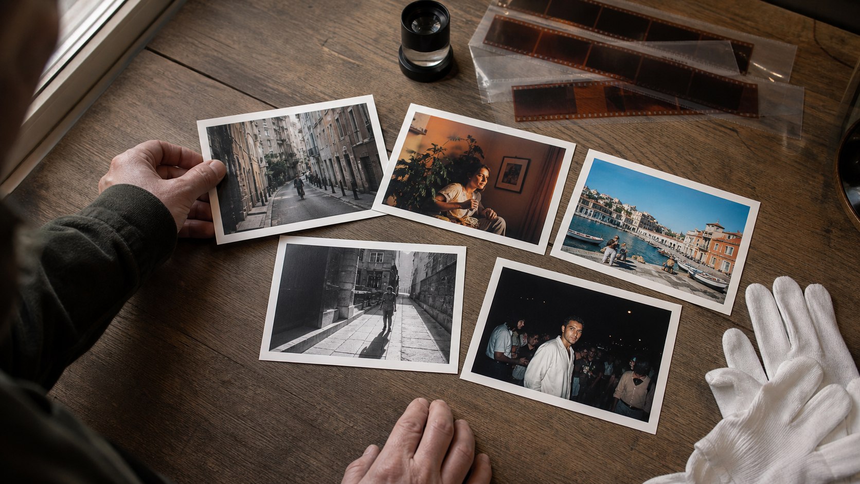
The easiest way to choose a preset is to stop looking at preset names for a minute. Look at the photograph instead. Is the light soft or hard? Are people the reason you took it? Is color helping the frame, or making it noisy?
A good look supports the answer. It should not be the first thing you notice.
When the choice has narrowed to two familiar brand directions, compare Kodak- and Fujifilm-inspired color by what it does to the frame, not by a warm-versus-cool slogan.
Start with what is already working
Before changing anything, find one part of the photo you want to keep. It might be natural skin, a blue evening sky, the warm light from a restaurant, or the shape of a shadow. That becomes your reference point while you try different looks.
If every preset destroys that part, the problem is not that you have not found a strong enough preset. You probably need a quieter one.
Busy streets usually need less color
Street frames often contain signs, brake lights, painted walls, clothing, and several kinds of artificial light. Increasing saturation makes all of them compete.
Try a restrained recipe such as Classic Chrome or Eterna. Cooler shadows and quieter color can make the scene easier to read without turning it gray. Drag the divider over red signs and faces; those are usually the first areas to look unnatural.
For portraits, judge skin before mood
Warmth feels flattering until it pushes skin toward orange. Contrast feels crisp until it hollows out eyes or loses dark hair.
Astia Soft, PRO Neg. Std, Portra Warm, and Portra 160 are sensible starting points. Compare the cheek, forehead, and white clothing rather than staring at the whole image. If those areas still look believable, the rest of the color usually falls into place.
Indoor portraits under warm bulbs often need less intensity than outdoor portraits. The original light has already done some of the warming for you.
Landscapes can carry more color—but not every landscape should
Clear sky, water, foliage, and painted buildings can handle stronger separation. Velvia Vivid or Ektar 100 can give a bright travel frame the snap it needs.
They are less convincing in haze, flat noon light, or a frame with a large face in the foreground. Strong color cannot create good light. When the original is quiet, Provia or Reala Ace often gives it enough shape without pretending the day was more dramatic than it was.
Choose black and white for structure, not rescue
Black and white works when gesture, geometry, texture, or light direction is stronger than the color. It can simplify a messy palette, but it cannot fix a frame with no clear subject.
Acros Mono keeps a fine, controlled texture. T-Max 400 is clean and graphic. Tri-X 400 is rougher and better suited to hard side light, live music, or street scenes where grain belongs to the atmosphere.
Before committing, check whether the subject and background become the same shade of gray. If they do, try a different monochrome mix or return to color. You can compare those tonal differences on your own frame with the black-and-white filter, paying particular attention to faces, midtones, and the deepest shadows.
Direct flash is allowed to be a little ugly
Party photographs and late-night snapshots often look better when they keep some of the bluntness of a compact camera. Dense blacks, obvious grain, and a color cast can make the frame feel immediate.
Night Flash '99 stays cool and rough. Pocket Flash 2004 is warmer and more playful. Both can clip a bright face, so drag the divider across skin before export.
A quick way to decide
Try this instead of clicking through every recipe:
- Pick one neutral option, one moodier option, and one deliberately bold option.
- Set each around 70%.
- Compare the same three areas: skin, the brightest highlight, and the deepest useful shadow.
- Keep the quietest version that still changes the feeling of the photograph.
If you notice the preset before the subject, lower the intensity by ten points and look again. Open the film photo effect editor and let the frame—not the recipe name—make the final call.