
How to Make Photos Look Like 35mm Film (Without Overdoing It)
Build a believable 35mm film look with better source light, restrained contrast, color separation, grain, and filter strength.
 FilmFX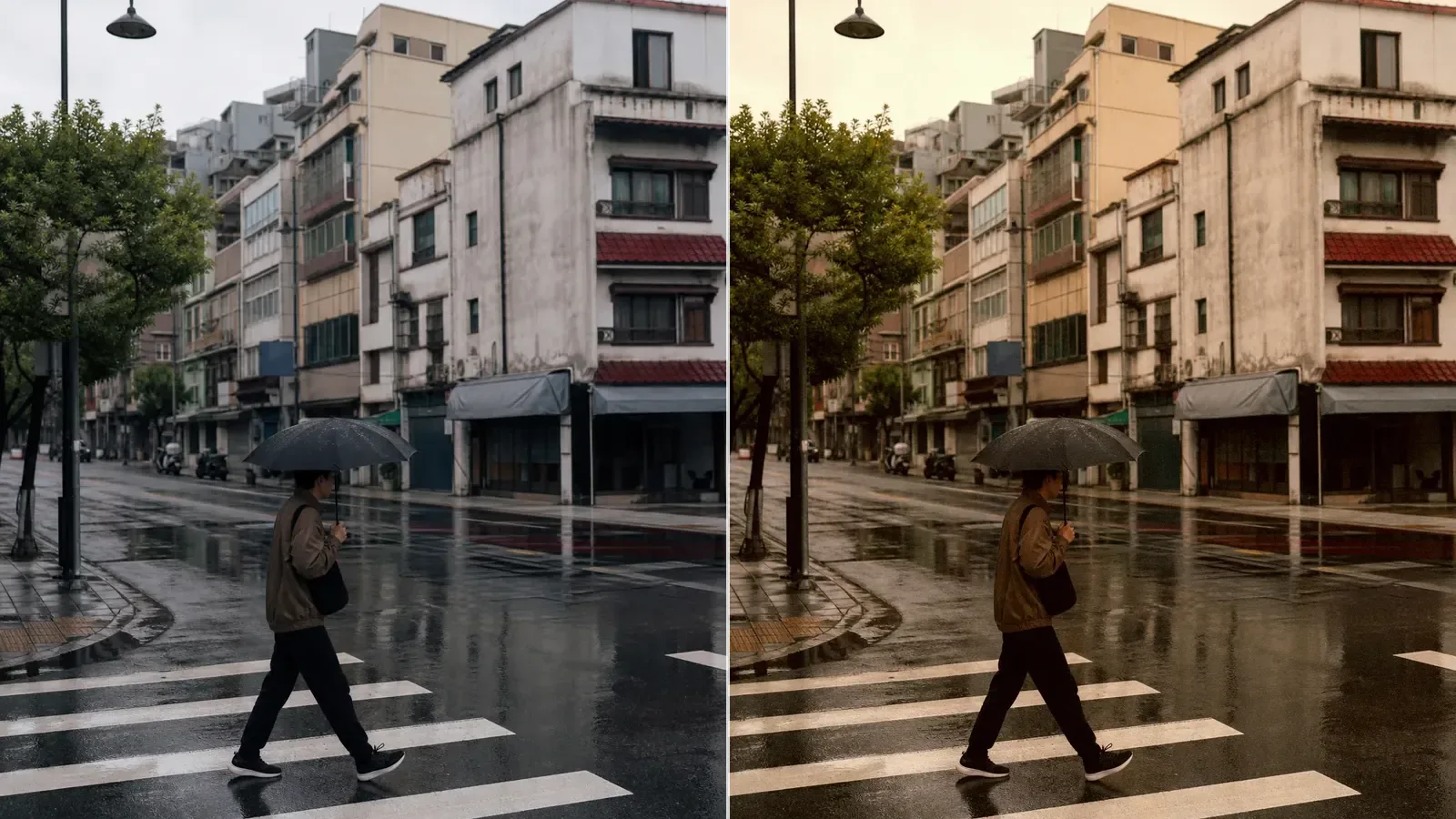
To make a digital photo look like 35mm film, do not begin with grain. Begin with the relationship between highlights, midtones, and shadows, then choose a restrained color direction and add texture last. Grain can support that structure; it cannot create it.
The photograph also has to give the edit something useful to work with. A white sky with no detail, a face buried in darkness, or aggressive phone sharpening will remain visible beneath any film filter.
What people usually mean by a “35mm look”
There is no single 35mm color. The term describes the film gauge, not one stock, camera, lab, or scan. A clean daylight negative, a pushed black-and-white roll, and a disposable-camera party frame can all be 35mm and look nothing alike.
Still, many photographs we recognise as film share a few quieter traits:
- Bright areas roll off instead of snapping abruptly to flat white.
- Midtones carry the subject without excessive local contrast.
- Shadows are not perfectly neutral and may lean slightly cool, green, or warm.
- Fine texture is visible without covering eyelashes, fabric, or small type.
- Color feels selective: skin, foliage, sky, and red objects do not all become louder together.
That list is more useful than chasing a named preset at full strength.
Start with light that has shape
Soft window light, open shade, overcast streets, late afternoon sun, and direct flash all translate well, for different reasons. Each gives the frame a clear lighting idea.
Flat indoor ceiling light is harder. It often creates dull skin, green or orange casts, and dark eye sockets at the same time. Correct the largest color error before adding a film look. If the source is already very warm, a warm preset may only double the problem.
Protect the important highlight while shooting. On a portrait, that may be a forehead or white shirt. On a street frame, it may be a cloud, sign, or reflective car. A filter can soften an existing highlight transition; it cannot rebuild detail that was never recorded.
Shape tone before chasing color
Start by lowering the brittle, digital feeling rather than making the whole image faded. Keep separation around the subject, soften only the brightest end, and avoid turning every dark area into lifted gray.
A useful test is to compare three places:
- The brightest surface that should still have texture.
- A midtone on the main subject.
- The darkest area that still explains the scene.
If all three survive, the tone is probably doing its job. If highlights look chalky or dark hair merges into the background, reduce the effect before adjusting color.
Let the color have one opinion
Choose one main direction. You might want warm, easy daylight color; quieter documentary color; vivid travel color; or a cooler low-light palette. Mixing all four usually produces a photograph that looks processed rather than photographic.
White objects are a useful warning system. They do not need to be perfectly neutral, but if a white wall, shirt, and cloud all acquire the same heavy orange or cyan cast, the filter is too strong for that file.
Skin is another check, not a universal rule. Keep variation between cheek, lip, forehead, and shadow. When all of those areas collapse into one orange or gray tone, lower the strength.
Add grain only after the image works without it
Grain should be visible at the intended viewing size. Fine texture that looks elegant at 100% may disappear on a phone; heavy texture that looks exciting in a thumbnail may erase detail in a large export.
Judge the image once at normal screen size and once close up. If the photograph only feels convincing when you stare at the grain, the underlying tone and color probably need more work.
Resizing and JPEG compression can change the final texture too. This guide to filters and image quality explains why a small download may look softer even when the color treatment itself is sound.
Framing helps, but a fake border is not required
Many 35mm cameras produce a 3:2 frame, while phones often start at 4:3 or another ratio. Cropping to 3:2 can make a series feel more coherent, but it is not proof of authenticity. Keep the ratio that strengthens the photograph.
If the frame has distracting edges or a tilted horizon, crop and straighten the photo before judging the filter. That prevents you from using stronger color to compensate for a composition problem.
A practical FilmFX workflow
- Open the 35mm film filter with a photograph you know well.
- Begin around 65–75% strength instead of 100%.
- Drag the divider across the brightest useful highlight, skin or another familiar color, and one deep shadow.
- Compare a neutral option with one warmer or more saturated option. Two or three choices are enough.
- Leave the screen for ten seconds, then keep the version in which the subject—not the effect—returns to your eye first.
- Export at the original size when you want to preserve the source dimensions.
Gold 200 is a friendly warm starting point. Classic Chrome is more restrained. A black-and-white stock may suit a frame whose light and gesture are stronger than its color. The right answer depends on the photograph, not the name on the card.
When a film filter will not solve the problem
A filter cannot create real direct-flash shadows, shallow depth of field, missed focus, halation around a light source, or the unevenness introduced by a particular lens, film, development, and scan. Some of those can be imitated; none should be added automatically.
The goal is not to pass a digital file off as a lab scan. It is to borrow the tonal restraint, color relationships, and texture that make many film photographs pleasant to live with. If the result feels less brittle and the subject still looks like itself, the edit has probably gone far enough.