
Sepia vs Black and White vs Vintage: Which Look Fits?
Compare brown monochrome, neutral gray and faded color on the same portrait. Learn which details to judge before committing to an old-photo effect.
 FilmFX
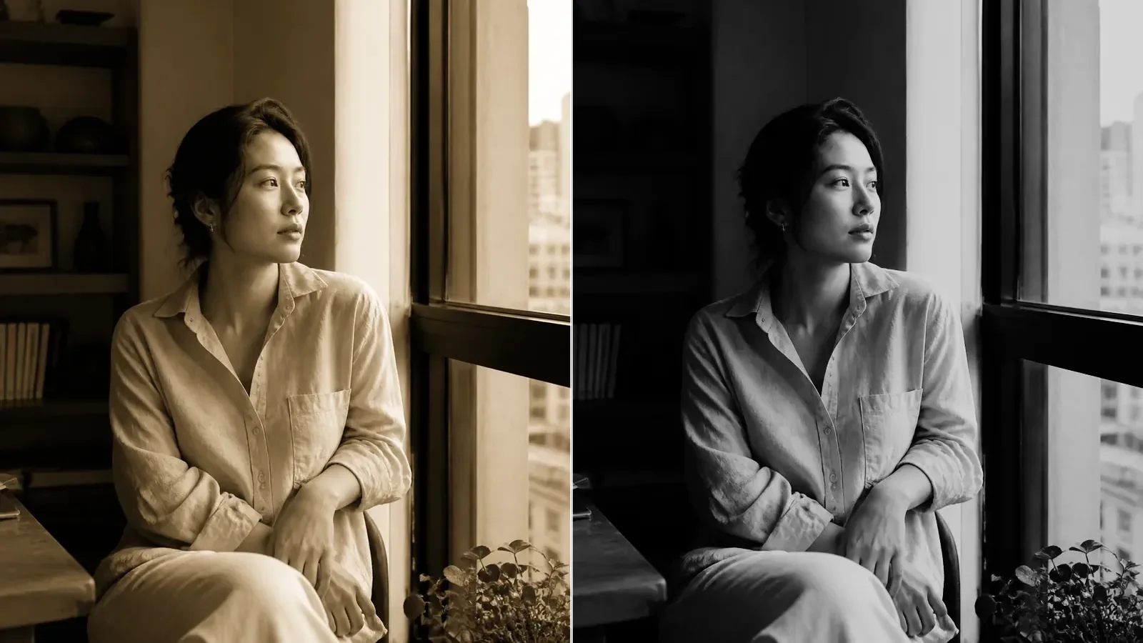
Sepia turns an image into brown-toned monochrome. Black and white uses neutral gray tones. Vintage is a broader style that can keep color while making it look faded or shifted. They can all suggest an older photograph, but they do not solve the same editing problem.
Before choosing, ask what you want to keep: the light across a face, the color of a coat, or the sense of a small print in a family album. That detail is a better starting point than making the whole picture look “old.”
What changes—and what you give up
| Treatment | What carries the picture | What you may lose | A useful first check | | --------------- | -------------------------------------------------------- | ------------------------------------------------------ | ------------------------------------------------------- | | Sepia | Brightness, texture and a brown tone | Distinctions that depend on hue | Can you still separate the subject from the background? | | Black and white | Light, shadow and neutral gray | Color clues and warm/cool contrast | Do adjacent objects merge into similar gray tones? | | Vintage color | Remaining color, softened contrast and a particular fade | Clean whites or strong blacks, depending on the recipe | Does the fade hide detail you actually need? |
None is automatically more flattering or more authentic. A brown cast cannot make modern clothing disappear, and a faded preset cannot turn an indoor phone shot into a sunlit film exposure.
Compare one portrait, not three different photographs
These examples use the same window-lit portrait and FilmFX's actual rendering pipeline. The source is an AI-generated demonstration image, not a film scan. It is held constant so the treatment—not a different face or different lighting—accounts for the visual change.

The original gives you three useful references: the face, the shirt and the darker background. Look at those areas in each result.
Sepia: make color secondary
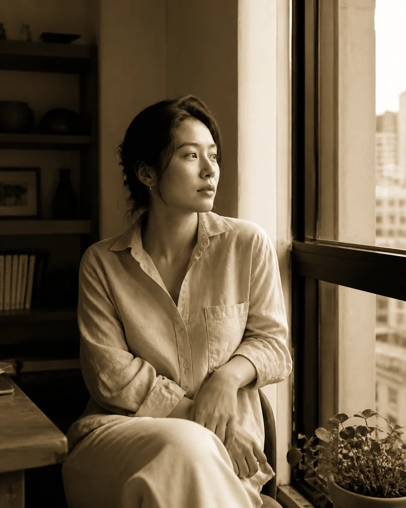
This uses Sepia at 100%, with no added grain, vignette or color adjustments. The face and shirt are separated by brightness, not by their original colors. The lightest parts remain close to neutral; a sepia image does not need to be uniformly orange.
Use this direction when color is distracting but you still want a warm tonal image. Avoid it when hue is important evidence: a product color, a flower variety or a carefully chosen outfit may become harder to read. You can try the sepia filter at a lower strength to bring back some original color, but that becomes a blend rather than full brown monochrome.
Black and white: let light do the talking
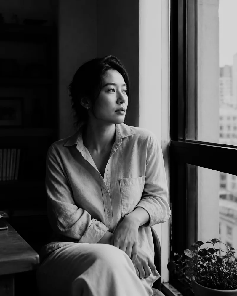
This version uses Acros at 100%. Unlike the Sepia recipe, Acros has its own contrast and texture treatment, so this is a comparison of complete looks, not a laboratory test changing only hue.
The absence of a brown tone gives the linen and background a different relationship. Check the edge of the face: if it merges into a similarly bright background, simply removing color has not improved the composition. Try another black-and-white treatment, adjust contrast gently, or keep the color original.
Vintage color: keep the color clues

This is Expired Color at 82%. It retains color while shifting the palette and lifting darker areas. The image can feel softer without becoming monochrome.
Choose vintage color when an object's color matters, or when you want a faded print rather than a brown print. Watch pale fabric and skin. If they become muddy, reduce the filter strength before adding more contrast. A retro snapshot look offers another direction with warmer print color or more lively decade-inspired color.
A short test on your own photo
- Keep an untouched original. Pick a frame with a face or another clear subject, a bright area and a dark area.
- Compare each look at its intended strength. Use 100% to judge full sepia or black and white; then try a lower strength if you prefer a color blend.
- Drag the before/after line across the subject. Check whether the background now competes more or less with it.
- Adjust exposure and contrast only when you can name the problem. “The face is too dark” is a useful reason; “old photos need more editing” is not.
- Download one copy and inspect it at the size you will share or print. Tiny previews can hide a heavy fade or too much texture.
In FilmFX, filter strength and the separate Adjust color controls sit below the image. Color adjustments stay when you switch filters; reset them if you want a fair comparison of presets alone. Uploading your own LUT is also possible, but a video Log LUT may be the wrong starting point for a normal phone JPEG. The LUT and preset guide explains that distinction.
A date is a separate decision
A brown tone does not require scratches, borders or a date. If a date helps identify the memory, add it deliberately using the photo date stamp tool. Check the date yourself: decorative lettering is not proof of when a picture was taken.
Start with the sepia comparison, then keep whichever version makes the subject easiest to read. The right choice may still be the original.